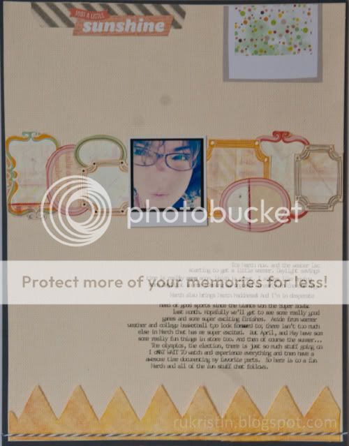
Today I'm sharing a fun layout I created for a ScrapFreak Freaky Friday challenge. The 'Trends & Design' challenge for this month was to work frames into your layout. I loved how this came out, even if the pictures aren't great. Sorry for the terrible photo quality -- I didn't realize how dirty my lens filter was until I uploaded the photos. Oops :)
I continued the horizontal theme with the banner at the bottom of the page with a misted canvas trim as well as some washi and a sticker at the top.
This was such a fun spring layout. I really love that frames are making a comeback.
Thanks for stopping by :)
Kristin


